WHOLE FOODS MARKET - DAILY SHOP
New Store Identity
AGENCY: INTERSTORE
WORK: BRAND DESIGN + MISSION, STORE IDENTITY, GRAPHIC CONCEPT
LOCATION: USA, NEW YORK CITY
Your Daily Shop around the corner: the new urban format from Whole Foods Market that seamlessly integrates organic food retail into everyday city life – Everyday for everyone.

A new logo with a rainbow
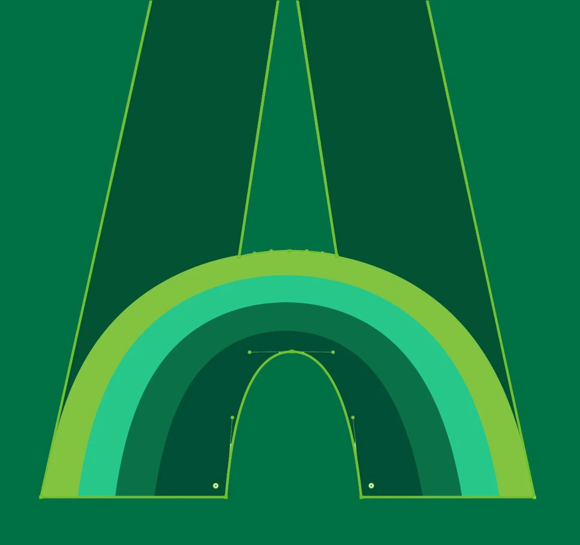
Inspired by the street lettering and posters in New York City, we created a wordmark that is both urban and incorporates a subtle detail: the curve in the letter “A.” These curve represents the friendliness and welcoming atmosphere of the new brand.

A Tone of Voice for the City That Never Sleeps
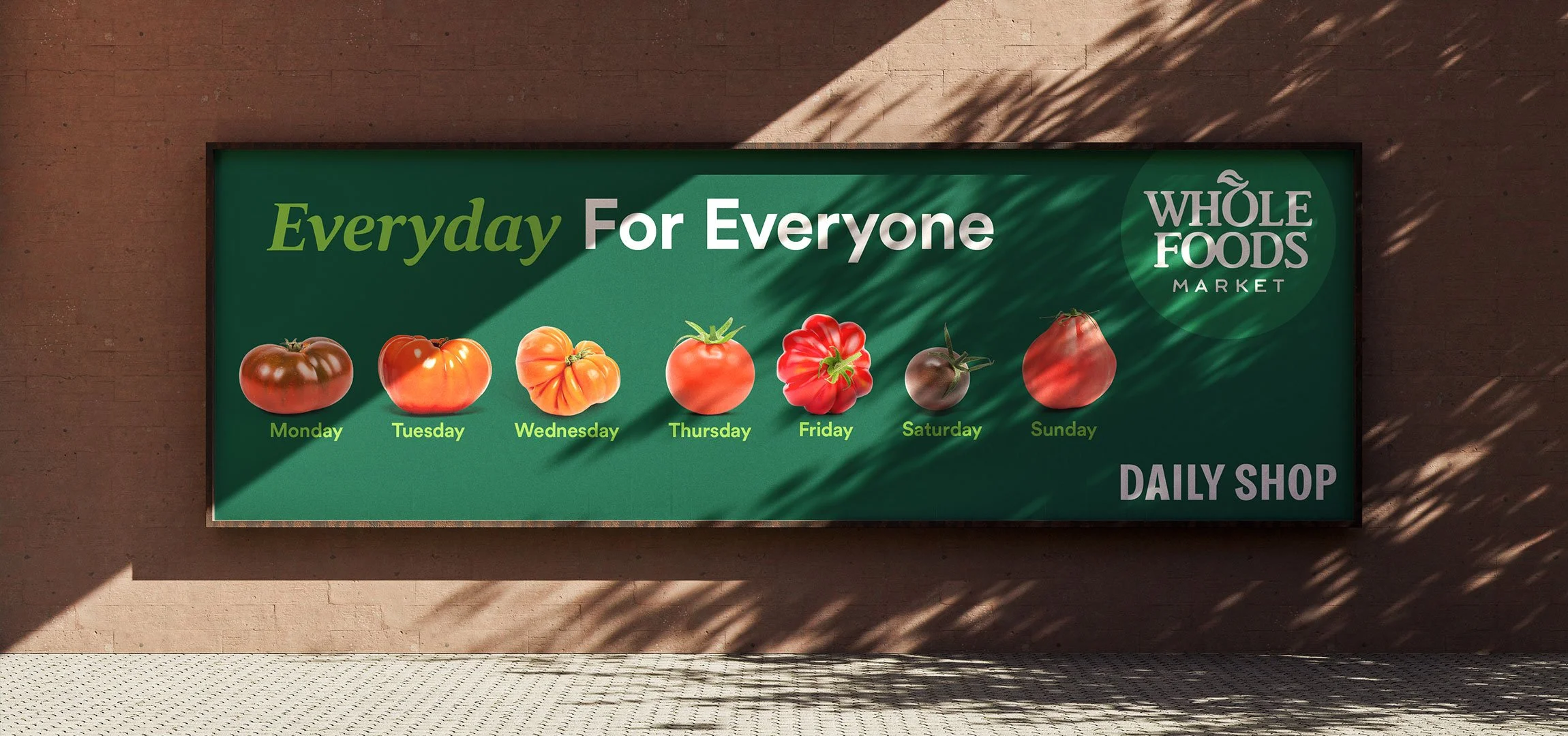
There for everyone, every day — and always welcoming: Everyday for Everyone. Together, we developed a direct approach that speaks the language of the target audience while clearly and simply highlighting the benefits of the new brand.
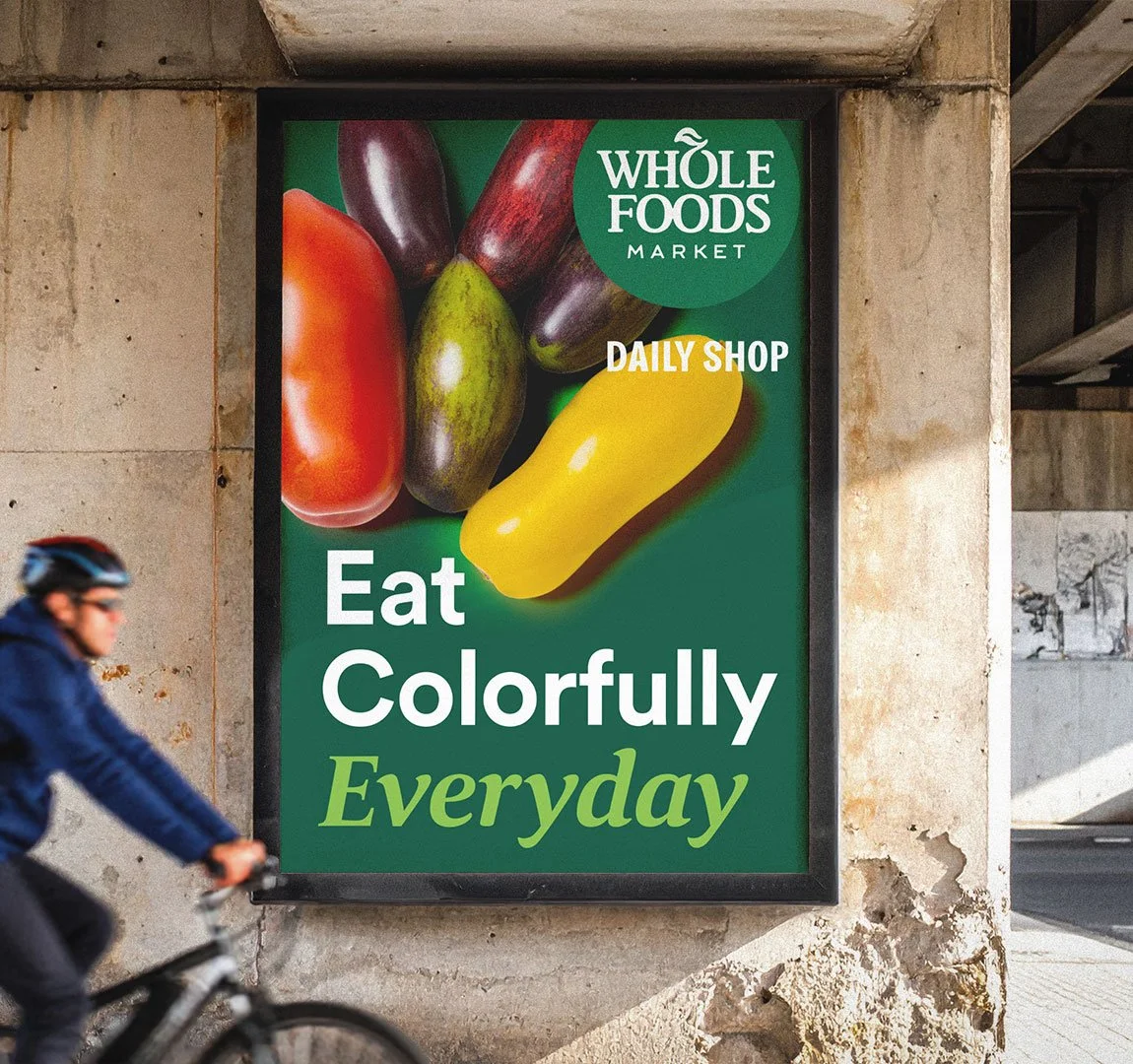
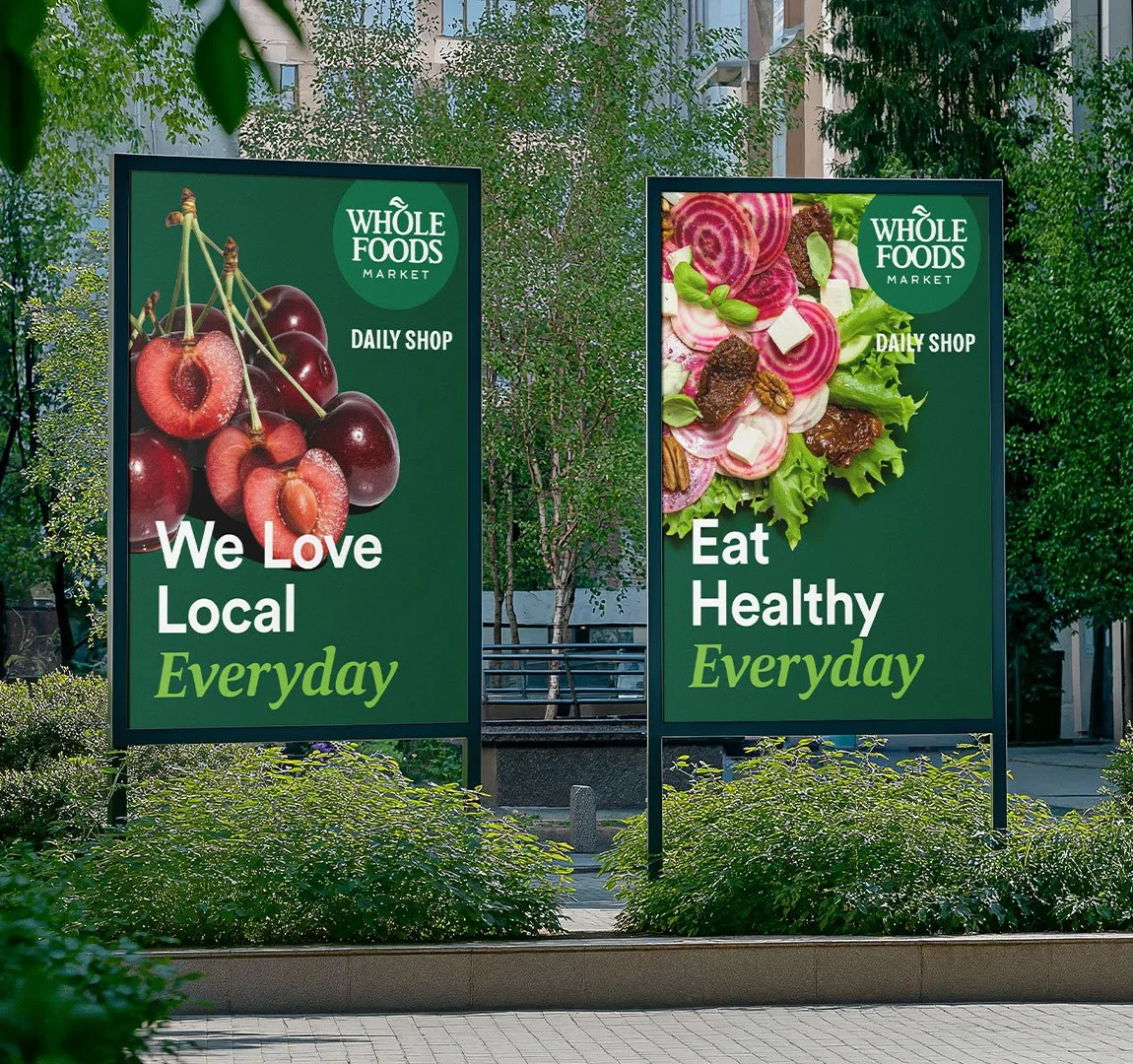


The Organic Pattern
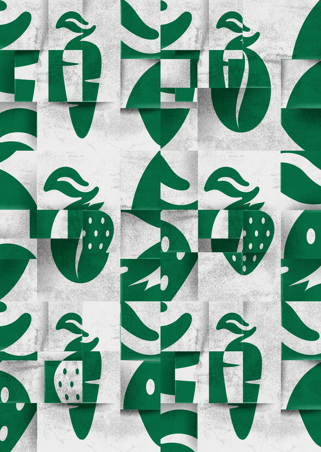
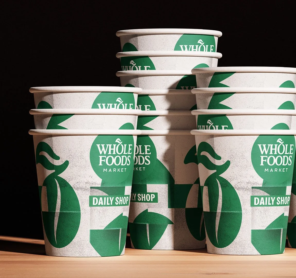
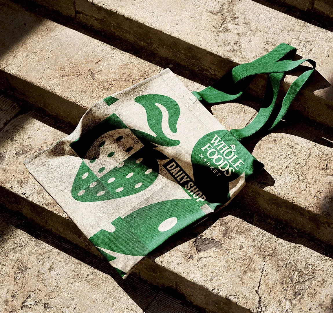
A graphic element consisting of key products, organized into various organic layers and shapes. The result? A visual element that both represents the brand and can be used flexibly.

The new store
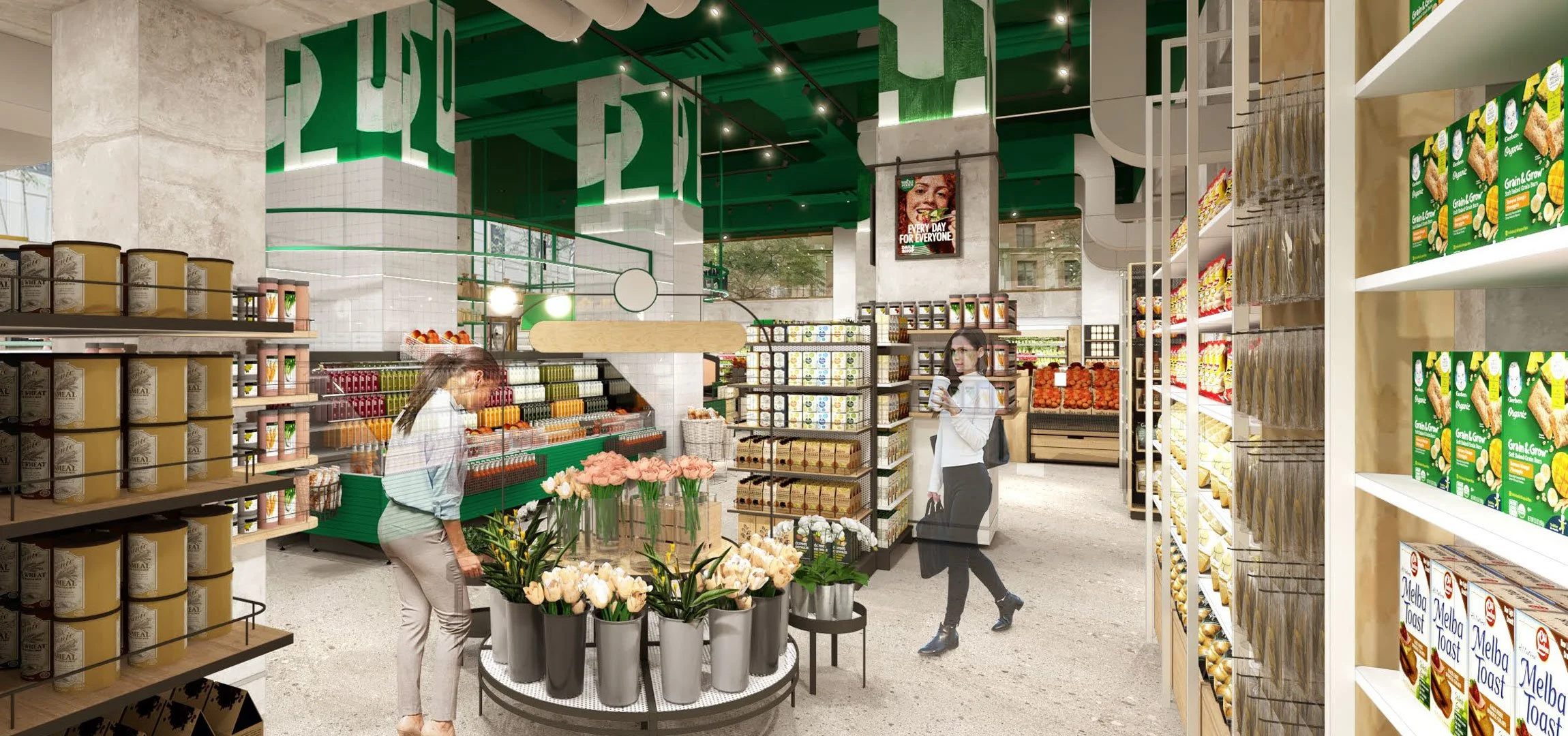
The design translates the brand identity into a new, urban approachability. Through its distinctive color palette and materials, Whole Foods’ DNA becomes intuitively apparent — without the need for a prominent logo.