
INTERSTORE | EDEKA
BERLIN’S NO1
Where a weekly market once stood, Berlin's market for daily shopping and enjoyment now stands again: EDEKA No1.
Together we have created a new main identity for the ‘No1’ as well as 9 in-house specialist.
1 MAIN BRAND + 9 SUB BRANDS / SPECIALISTS

Story Main Brand ‘EDEKA No1’:
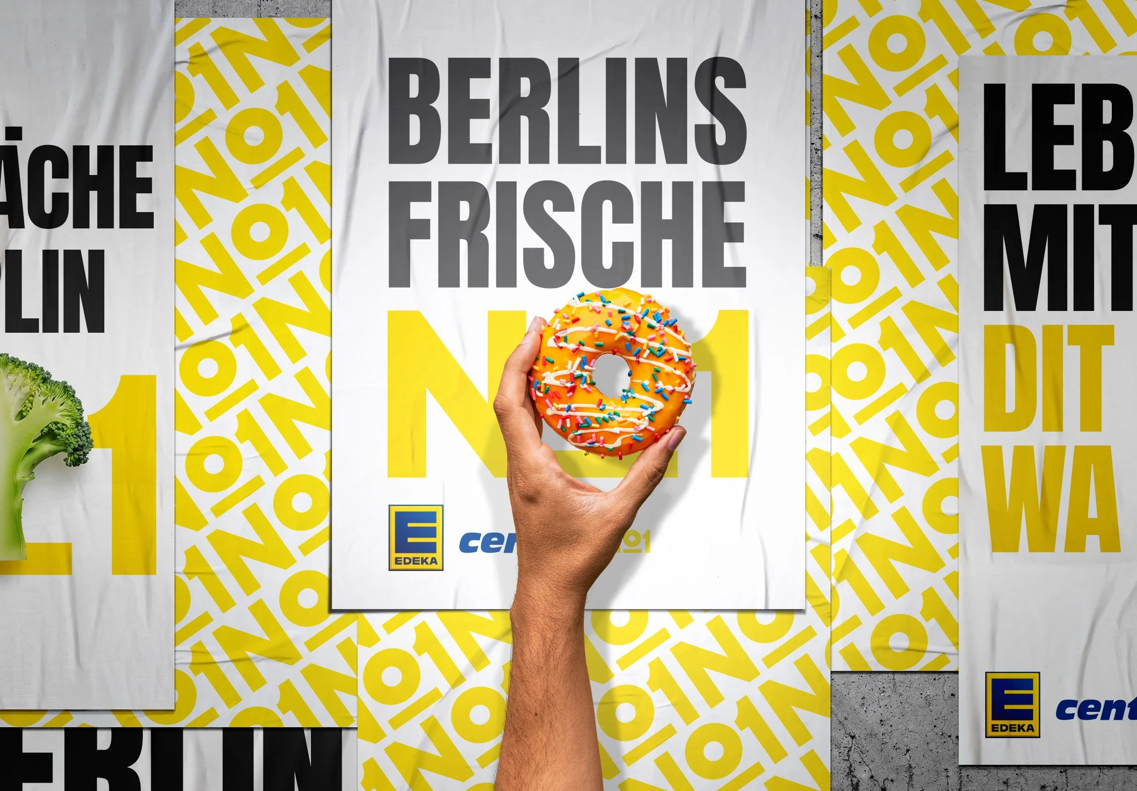
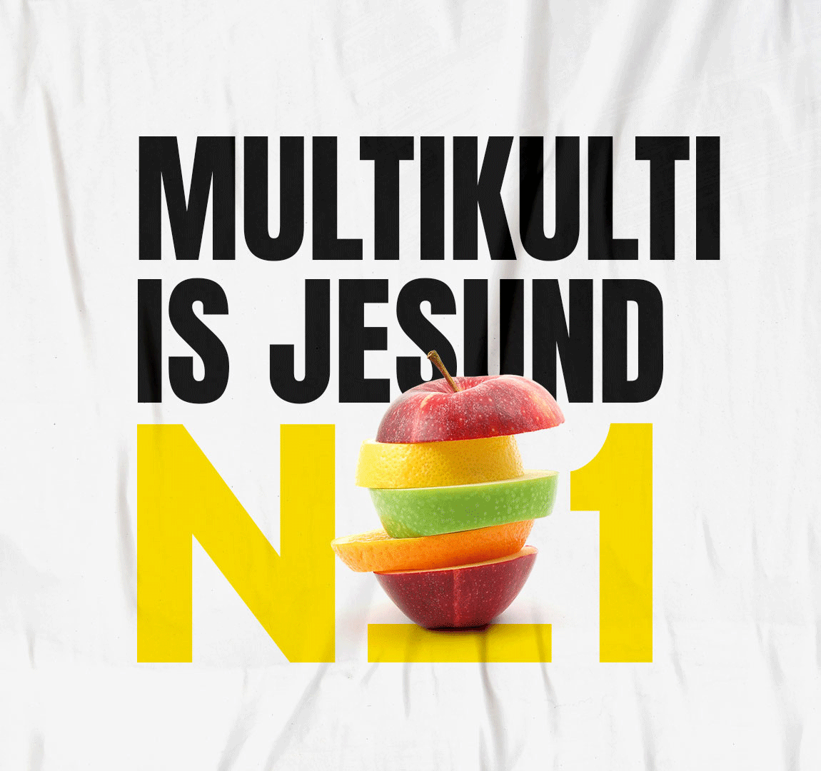
Berlin is constantly changing and incredibly diverse, especially in the gritty yet charming Steglitz district. To reach this target group, EDEKA relies on a simple and memorable visual design with authentic Berlin communication:
Direct, humorous, warm, and in the appropriate Berlin dialect – WEESTE?
MAIN BRAND ELEMENTS
STORYTELLING NO1
IN-STORE COMMUNICATION + ORIENTATION
STORYTELLING DEPARTMENTS
To ensure a consistent brand presence, we collaborated with EDEKA's marketing team to design the opening campaign and the construction site communication during the renovation.
CAMPAIGN - OUT OF HOME CONCEPT
CONSTRUCTION SITE
BAGS + GADGETS
SUB BRANDS
Eight sub-brands for EDEKA's No. 1. Each brand speaks to its target audience on equal terms and has been given a completely new identity. From the logo to the fonts, stories to the packaging and staff uniforms, just like in a specialist store.
‘COFFEE’ IDENTITY ELEMENTS
‘DIE FLEISCHER’ IDENTITY
‘BACKMEISTER’ IDENTITY
‘EXTRAWURST’ IDENTITY

BRANDS IN COLOR
•
STORYS IN COLOR
•
GRAPHIC IN COLOR
•
BRANDS IN COLOR • STORYS IN COLOR • GRAPHIC IN COLOR •
© OLIV STUDIO 2026